Case Study #2 - E.K.D (Every Kid Deserves)
We wanna help every kid connect to the resources out there. So they can get back to the things that really matters to them. Why? Because Every Kid Deserves!
There are children in the U.S. that suffer from lack of food, violence, resources, and/or etc. I wanted to create the E.K.D. (Every Kid Deserves) App to give the children in these circumstances a platform where they can independently or with the help of a trusted guardian receive access to some of the resources they need. Resources like:
- Safe Spots
- Fun Outlets
- Community Service
- Educational Services
- I Just Need Something…
- Health
- Ministry
I wanted to try to provide a way where kids can have some of their essential needs met. So that way they can focus on the other important priorities in their life as well. Hence, work on how they are going to build a better life for themselves, and becoming the best person they can be physically, mentally, and spiritually.
Children/youth from low-income families, children/youth of color, children/youth in foster care (and those who have aged out), and children/youth living with disabilities. Before the pandemic, these groups have struggled the most so far as development, emotional and behavioral health, social, and economic well-being, and in other ways as well. Since, the society has opened up a bit more now, and these groups are still recovering from the impact of the stay-at-home orders. Perhaps, the E.K.D. App can help somewhat relieve children (and their legal guardians) of having to worry about their basic needs.
Understanding the Audience
Personas & User Scenarios
To create a service where children can find resources that provide some their vital or secondary needs. I came up with two circumstances for personas that would use the E.K.D. app, and tried to describe what some of their needs, wants, and habits were. As well as identify the problems that they faced, their fustrations, and what interest and hobbies they like to do in their free time.
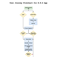
To get an idea for how the navigation of the E.K.D. app would operate, I created a flowchart on draw.io. Then to prove the E.K.D. app useful and efficient for the personas. I created a short storyboard skit (or comic strip), portraying one of the personas having one of their wants met by the E.K.D. app.
Understandng the User Experience
"Paperless" Prototype
Part 1 - Lo-Fi Wireframe
Here was some of the feedback that I got back:
- Add a scroll feature to my pages. Especially, the ones that give results. I was also thinking of a swipe feature, or adding arrows for the user to press on to go the next page of results.
- On the results page, add a title, a link, a phone number, and a address to make it easy on the user.
- On the organization page, having a phone number or someway to contact the organization through the app to make it easier for the user to not have to go through another platform to find contact info.
- Set up a location page so your app only gives the user what is in their area.
- Link your phone's calendar to the one in your app that way the user could receive reminders from their personal calendars.
Part 2 - 1st Prototype
Designing the screens of Lofi-Wireframe.
1st PrototypePart 3 - 2nd Prototype
Focusing on figuring out the Layout (Grids), Type (Size and Selection), Colors (a specific palette), and Style/Metaphor (personality) for the design of the E.K.D. app.
2nd PrototypePart 4 - 3rd Prototype
3rd PrototypeJust making a few tweaks to the arrangement of the buttons and text.
IT'S ALIVE! BWAHAHA!!!
Final Designs & Conclusion
Final DesignThanks to the process of Case Study #1, going through and building the E.K.D. app was a breeze at this point. But since the E.K.D. app was based off a topic that affects people every day in their lives. This thought was in my mind and a continous theme throughout the process of this project. In the future I would like to work on getting more info on the resources to the user, so that way they will not have search online for them as much. I would like the info to be immeadiately available for them. It would also be cool to set up a chat room as well for the users. So that way they can share helpful ideas and tips with each other on the various obstacles that they are facing, and build a support group among themselves. Besides those concerns, I am pretty satisfied with the way the app turned out so far. It can always use improvement, but I'm just glad that I was able to make it happen! I feel like a concept like this, if done really well, could really come out useful to society.


